MY WORK
A collection of projects spanning commercial real estate, brand strategy, web design, and social media.
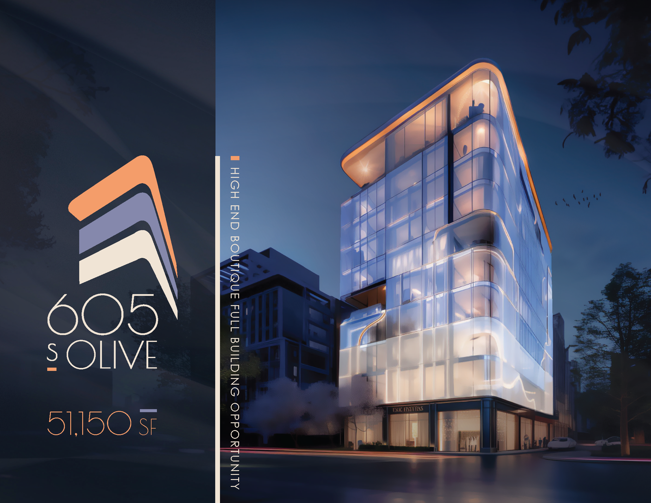
605 S Olive St.
West Palm Beach, FLA brand-new build with only renderings to work from, and a vision I saw through from the first Pinterest board to the final map.
605 S Olive St.
West Palm Beach, FLThis is one of my favorite projects from my time at JLL. I was assigned to work alongside another property marketer but took the lead on the creative from the start. With only renderings to work from on a brand-new building, I built a Pinterest board to develop a visual direction, wrote a detailed creative brief describing the building and the vibe we were going for, and specifically requested that the unique shape of the building be incorporated into the logo. Once the design team came back with options, I presented the branding to the brokers and guided them through the selection. From there I briefed the brochure, pulling inspiration from new builds in Miami's Brickell neighborhood, broke down each page, and organized all assets for the designer. I simultaneously managed the neighborhood map as a separate workstream with JLL's offshore team, which required much more specific direction, including annotated Google Maps screenshots, a reference brochure I liked, and a detailed list of every neighborhood point we wanted to highlight. Maps were notoriously the hardest part of any brochure at JLL, and this one came out exactly as I envisioned. It was one of those projects where I had a clear vision from the beginning and got to see it all the way through.
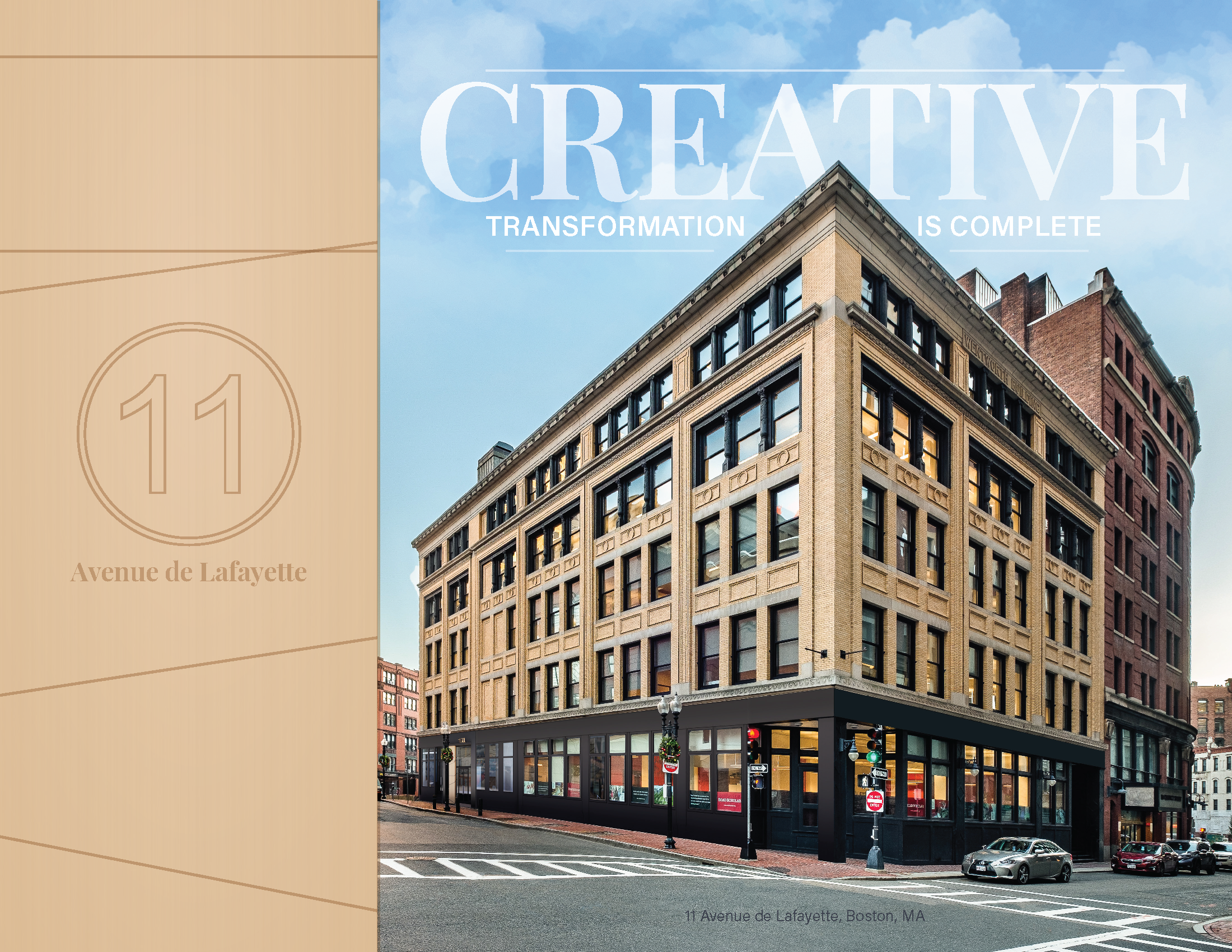
11 Avenue de Lafayette
Boston, MAA brand refresh with permanent constraints and a blank creative brief that was selected for an internal JLL excellence program.
11 Avenue de Lafayette
Boston, MAThis one came to me as a refresh rather than a build from scratch, which is its own kind of challenge. The brand already existed and the logo was printed on permanent building signage, so I had to work within those constraints while still finding ways to make the brochure feel current. I specifically requested a designer I'd worked with before, someone whose creativity and genuine enthusiasm for his work comes through in everything he produces. I wrote what my manager and colleagues always told me were unusually thorough creative briefs, and this one was no exception: exactly which elements to remove, how to rethink the layout, what to combine, what to cut entirely, and the overall direction I wanted him to take it. I gave him room to be creative within that framework because I trusted what he was capable of, and he delivered. Ownership loved it, and my manager submitted both this brochure and the email campaign I built alongside it to an internal JLL program that highlights excellent work for property marketers to use as creative brief references. Both were selected.
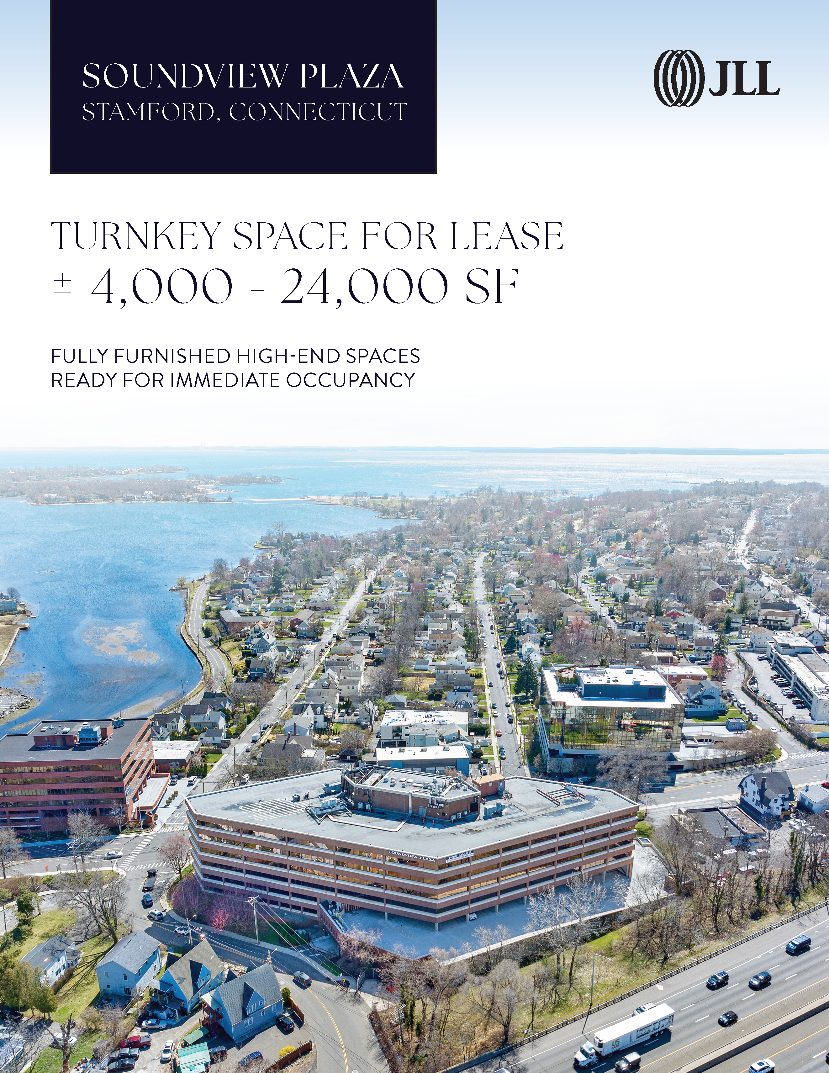
Soundview Plaza
Stamford, CTFrom a blank slate and a Pinterest board to a fully cohesive seaside brand, map and all.
Soundview Plaza
Stamford, CTSoundview was another project where I started with almost nothing, just a few photos and no existing brand assets. I worked directly with the two Stamford-based brokers, who trusted me enough with the creative direction that they didn't ask to review the branding before we moved into the brochure, which I loved. I built a Pinterest board, developed a clear vision, and briefed the brand and brochure together in one go. I wanted a clean, light, seaside aesthetic that still felt polished and professional, and given that the building has breathtaking water views, I had a lot of fun weaving that into every design decision. The map was again a separate workstream with JLL's offshore team, requiring the same level of detailed direction, but this one came out better than almost any map I worked on at JLL. It's visually cohesive, matches the branding of the brochure seamlessly, and I think it really elevates the whole piece. I'm really proud of how this one came together overall, it feels like exactly what I set out to create from the beginning.
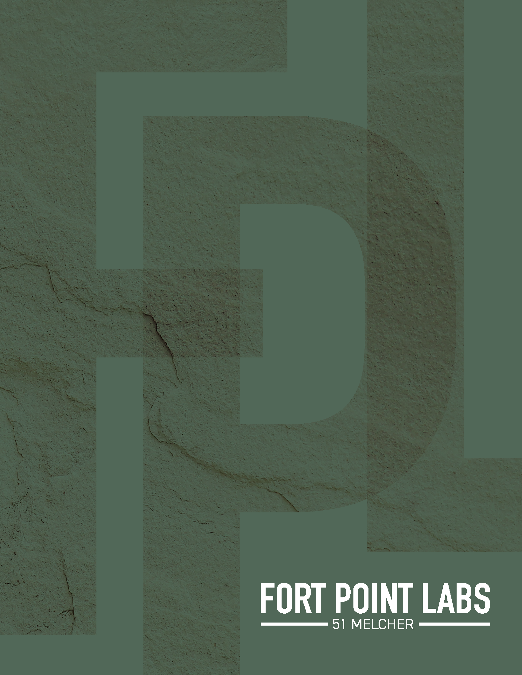
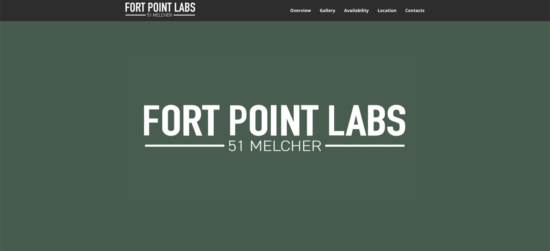
Fort Point Labs
Boston, MAA building that didn't even have a name yet, built into a full brand from a Pinterest board and pure instinct.
Fort Point Labs
Boston, MAThis project started from almost nothing: a call with the owner and broker, where they handed me what little information they had on an office building in Fort Point being converted into lab space. Cambridge has always been the epicenter of Boston biotech, but the Seaport has emerged as a real contender in recent years, and ownership wanted to position this building to capture that momentum. The building didn't even have a name yet. "51 Melcher" wasn't going to cut it, so I brainstormed options, did the research to confirm nothing similar already existed in the market, and presented Fort Point Labs to ownership, which they loved. From there I built the brand from scratch, again starting with a Pinterest board. Biotech branding tends to lean on bright blues and oranges, but this team wanted to honor the building's history in the historic Fort Point district instead, so we moved toward a deep green that nodded to the brick and stone exterior. I partnered with a designer I'd worked well with before and gave him a clear, detailed creative brief to bring that vision to life, all before we even had final building photography to work with. I also used Google Maps to find the angle that became the stacking plan, working with the designer and JLL's offshore team together to pull it off, while that same offshore team separately handled the floor plans. It was a project built almost entirely from instinct and direction rather than existing assets, and ownership was thrilled with the final result.
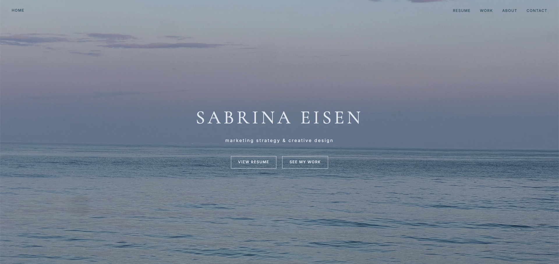
sabrinaeisen.com
I taught myself Claude Code to build this site from scratch, which was a first for me in the best way. I've built sites before through platforms like Wix, Weebly, and WordPress, but there were always constraints, things I wanted to do creatively that the platform simply wouldn't support. Building in HTML for the first time meant I could do exactly what I envisioned without hitting a wall. I saw it as an opportunity to learn an exciting new skill. What I brought to it was my design background, my years of experience working across those platforms, and a very clear sense of what I wanted it to look like and feel like. Every interaction, every animation, every color and font choice was intentional and directed by me. The result is something I'm genuinely proud of, and that I think represents who I am as a creative professional better than any template ever could.
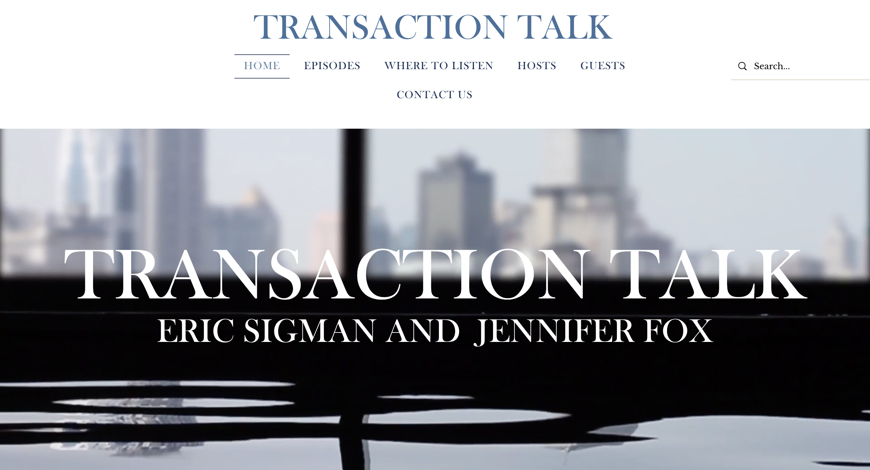
Transaction Talk
Transaction Talk is a podcast hosted by an attorney at Ruberto, Israel & Weiner and his business partner at Transamerica, and I built the whole brand from scratch. That means I designed the logo, selected the color palette, sourced a photographer, scouted the shoot location, and built the website you're looking at. It was my first experience building a brand entirely from scratch, and I presented a couple of options to the hosts before they landed on the direction you see today. I wanted the brand to feel polished and professional without feeling stiff, something that would appeal to the business and legal community without alienating a broader audience. The branding and site are still in use today, essentially unchanged from what I created in 2023, which I think is the best compliment a brand can get.
Fort Point Labs
The Fort Point Labs website was part of the broader marketing package I built for 51 Melcher Street, the same project where I named the building and developed the brand from scratch. Once the brand was in place, the website needed to bring that identity to life digitally. I wrote the copy, directed the visual approach, and worked closely with our designer to make sure the final product translated the deep green palette, the industrial-meets-innovation aesthetic, and the Seaport life science narrative into a cohesive online presence. Like everything else on this project, the brief started with me and the execution happened in close collaboration with the team around me.
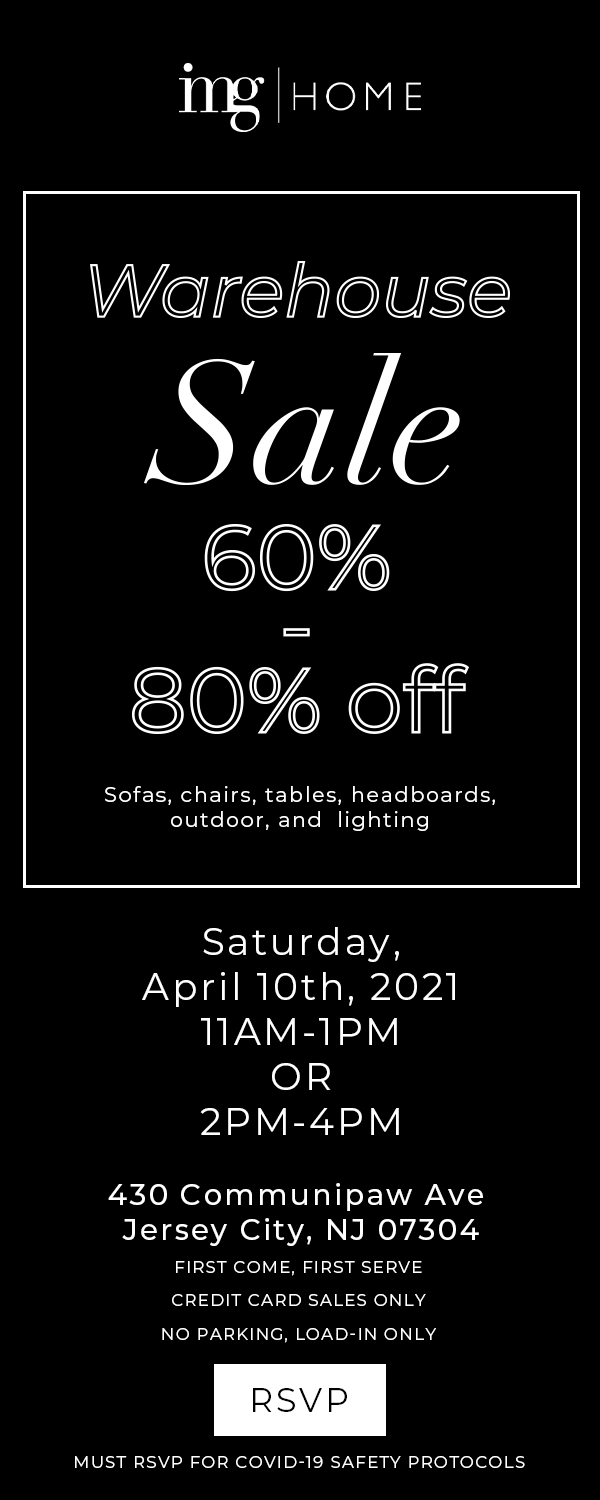
During my time at Interior Marketing Group, I produced animated GIFs for their newsletter campaigns, adapting existing brand templates with property photos and details for each send. The Warehouse Sale versions below were presented simultaneously as options for the campaign.
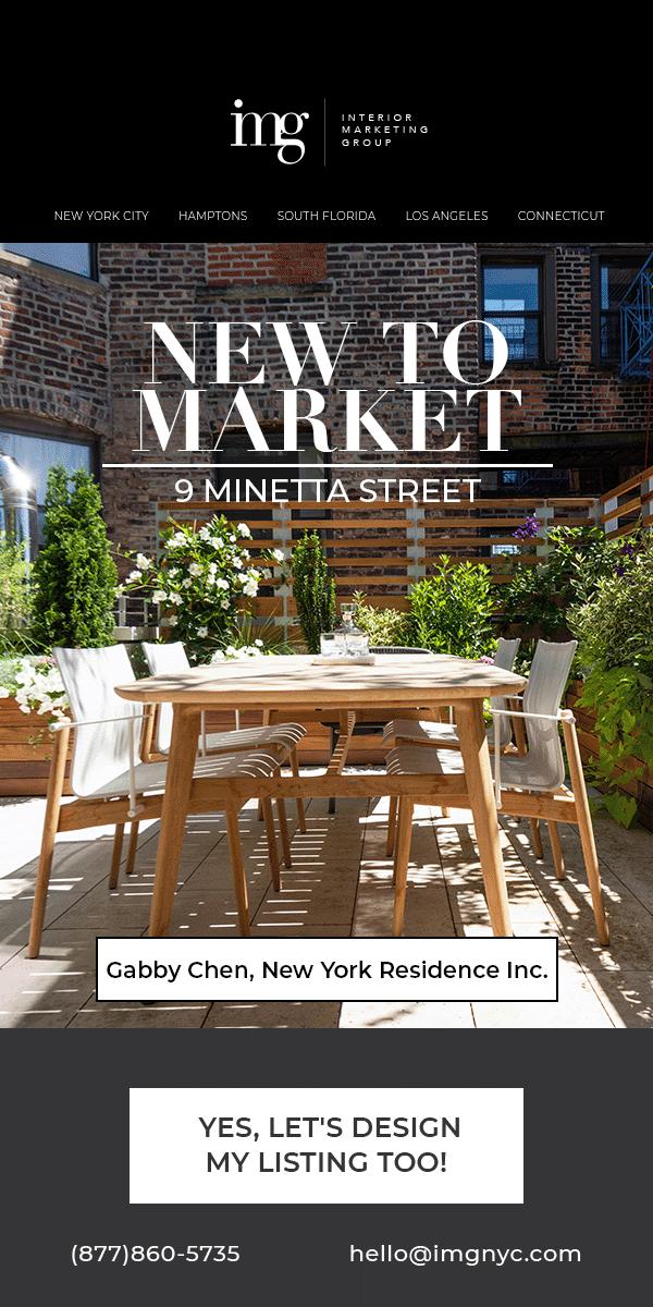
NEW TO MARKET — 9 MINETTA
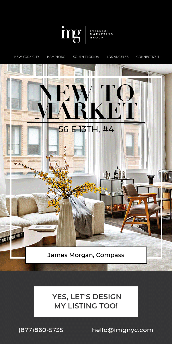
NEW TO MARKET — 56 E 13TH #4
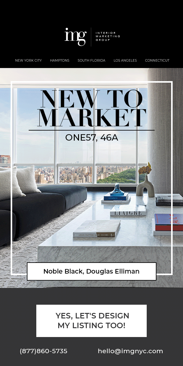
NEW TO MARKET — ONE57 #46A
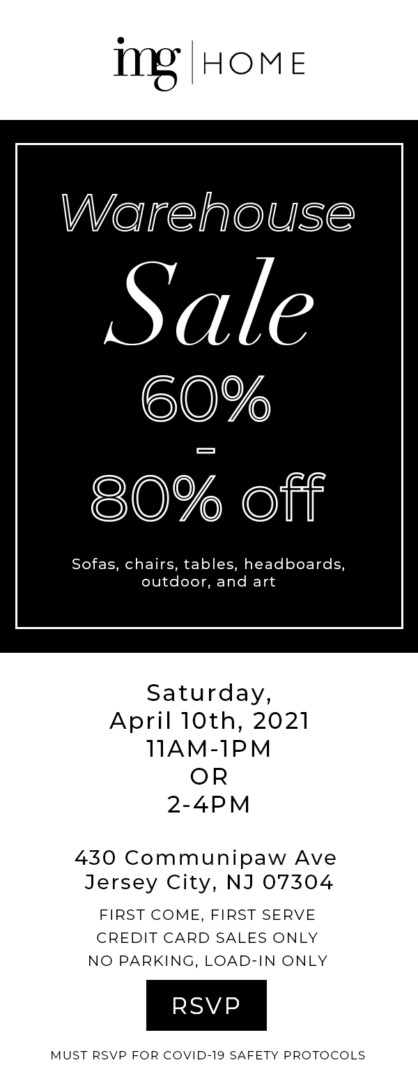
WAREHOUSE SALE — V1
ART LOFT ARCHITECTURE
WAREHOUSE SALE — V2